Rhino Splits
Mobile Application
UX / UI Design
UX / UI Design
Rhino Splits is a fictitious peer-to-peer money transfer app, where real data was collected, research was conducted and real people were interviewed... While at Nashville Software School, I was tasked with creating a mobile app that would make it easy for young adults to do peer-to-peer financial transfers. Below I have detailed my design process and included a clickable prototype. Read more
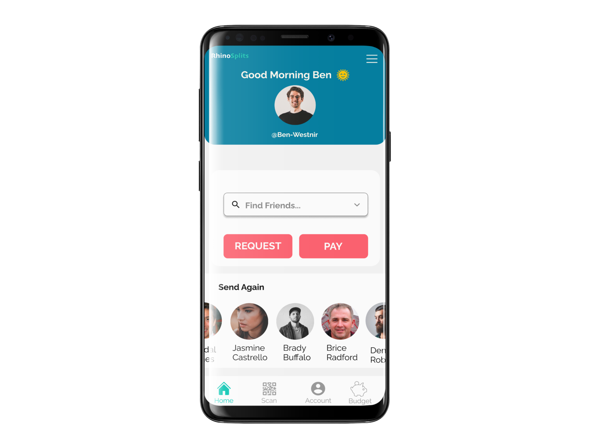
My role was to do the user research and design of this mobile app.
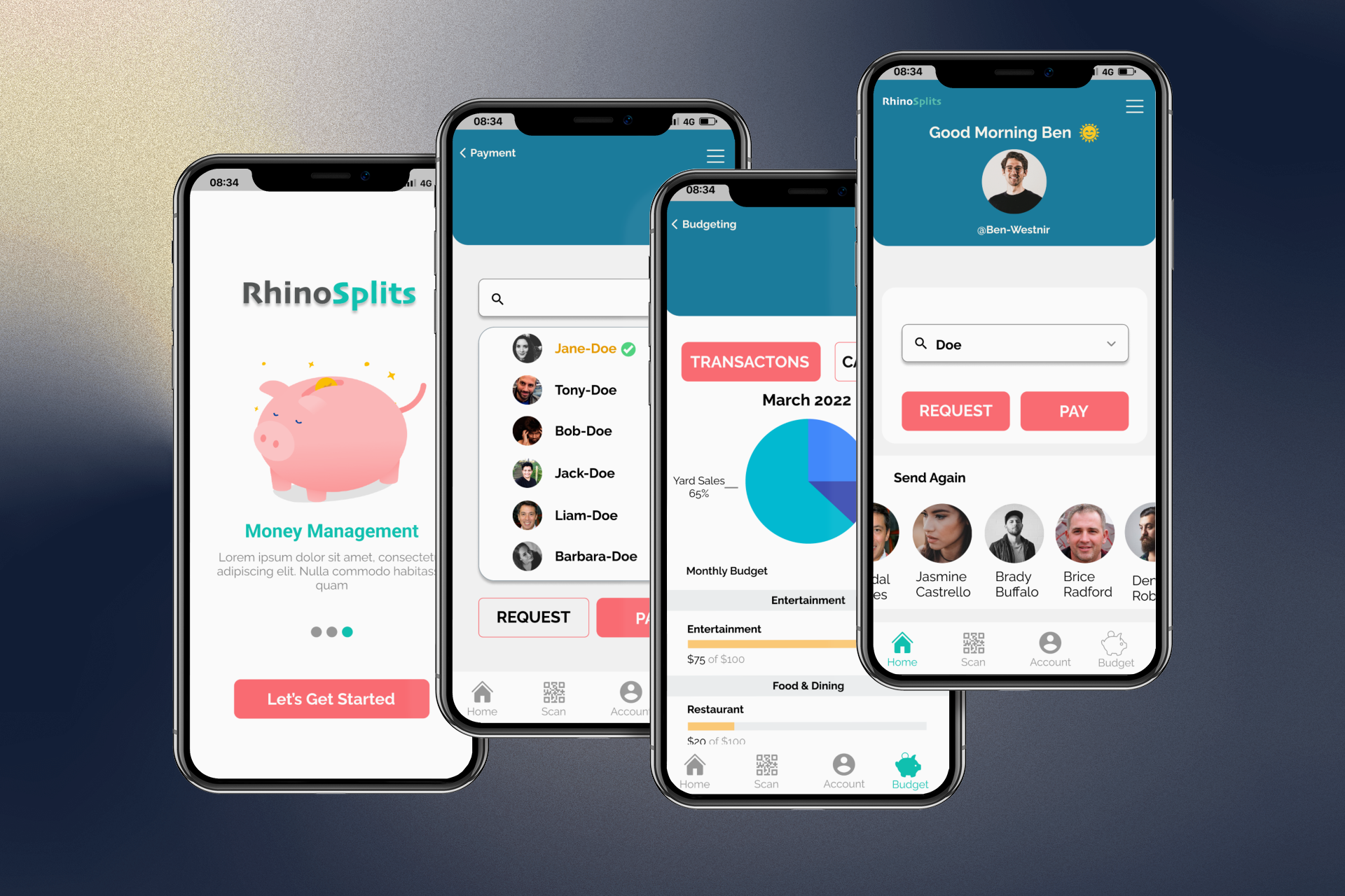
My approach was to create a simplistic application that does one thing… really well. Sends and receives money. It didn’t need a ton of bells and whistles, so my goal was to keep it straight and to the point.

How might we... provide a peer-to-peer payment method for young, social people that remains convenient, quick, private and has little, to no, learning curve.
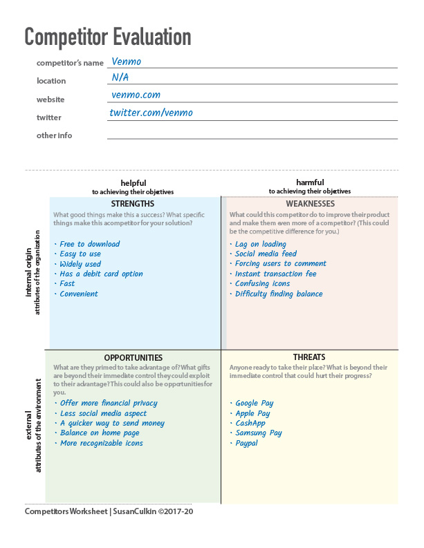
Since there was already an existing field of "digital wallets" on the market, I was able to analyze existing information about Venmo, Google Pay, Cash App, Apple Pay and Samsung Pay. While studying their apps, I compared their strength and weakness and was able to define areas of opportunity, where our app could supersede theirs.
Let's meet the users...
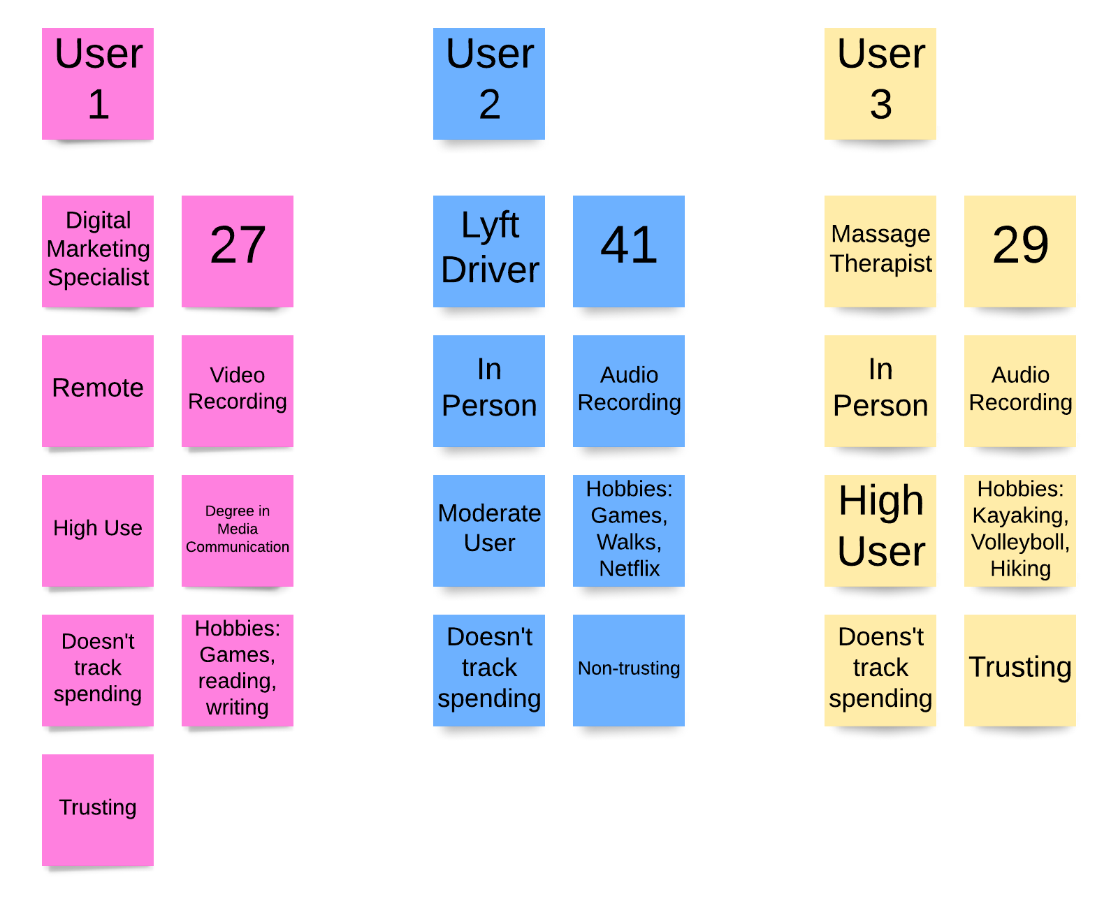
The user interviews may be my favorite part of the research process! I started my interviews with a friendly greeting, to make sure the interviewee is at ease and a disclaimer to let them know they are being recorded. Recording the sessions allows me to be more present and engaged in the conversation with user, rather than having break eye contact to write in a notepad. I started all my interviews with asking about the user's background. I slowly let the conversation turn to technology and their past and current experiences with digital wallets. My main goal when it comes to user interviews is to pull stories and experiences out of the user by making them feel comfortable, as if we are just having a casual conversation.


While there were quite a few emerging themes amongst the interviewees, there were three key insights I discovered. 1. The user is very private about their money 2. The user does not like wasting time and 3. The user prefers speed over security. These users want things fast, easy and with little bells and whistles. They want a meat and potatoes app to send and receive money. So that was my goal, to design a simplistic, to-the-point, digital wallet.
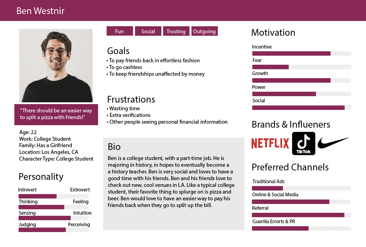
Our user persona started to take shape after analyzing the insights drawn from our market research and user unterviews. Our user is social, active and extremely private about money.
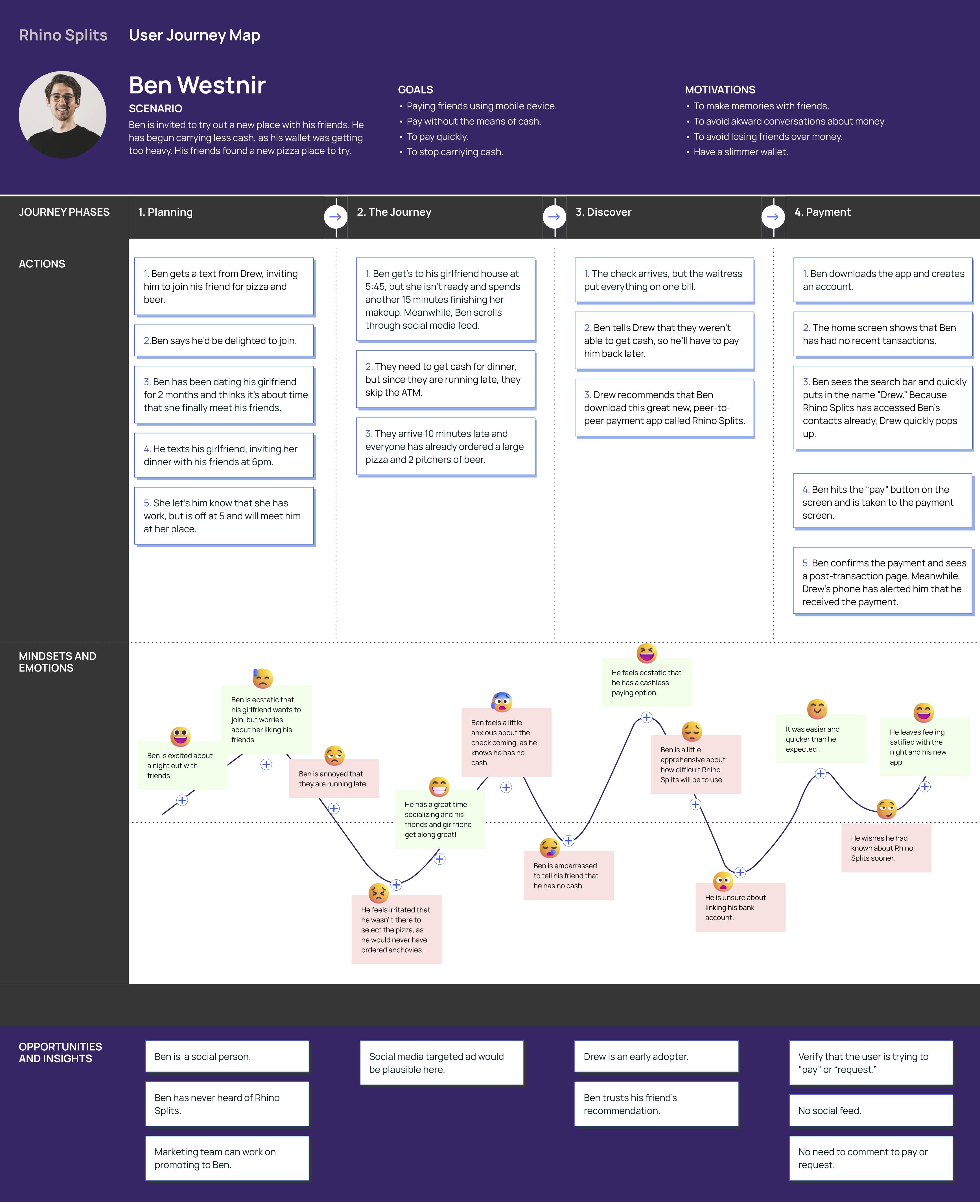
When asking the client what would define success for her, she said that would be when the app was so successful that "Rhino Splits" would be used interchangably as a verb. While coming out with this app later in the game, the success would not be coming from some of the eary adopters that jumped on the Venmo bandwagon, but the late adopters that are fed up with their limeted digital wallet options.
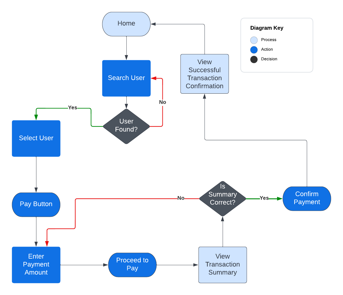
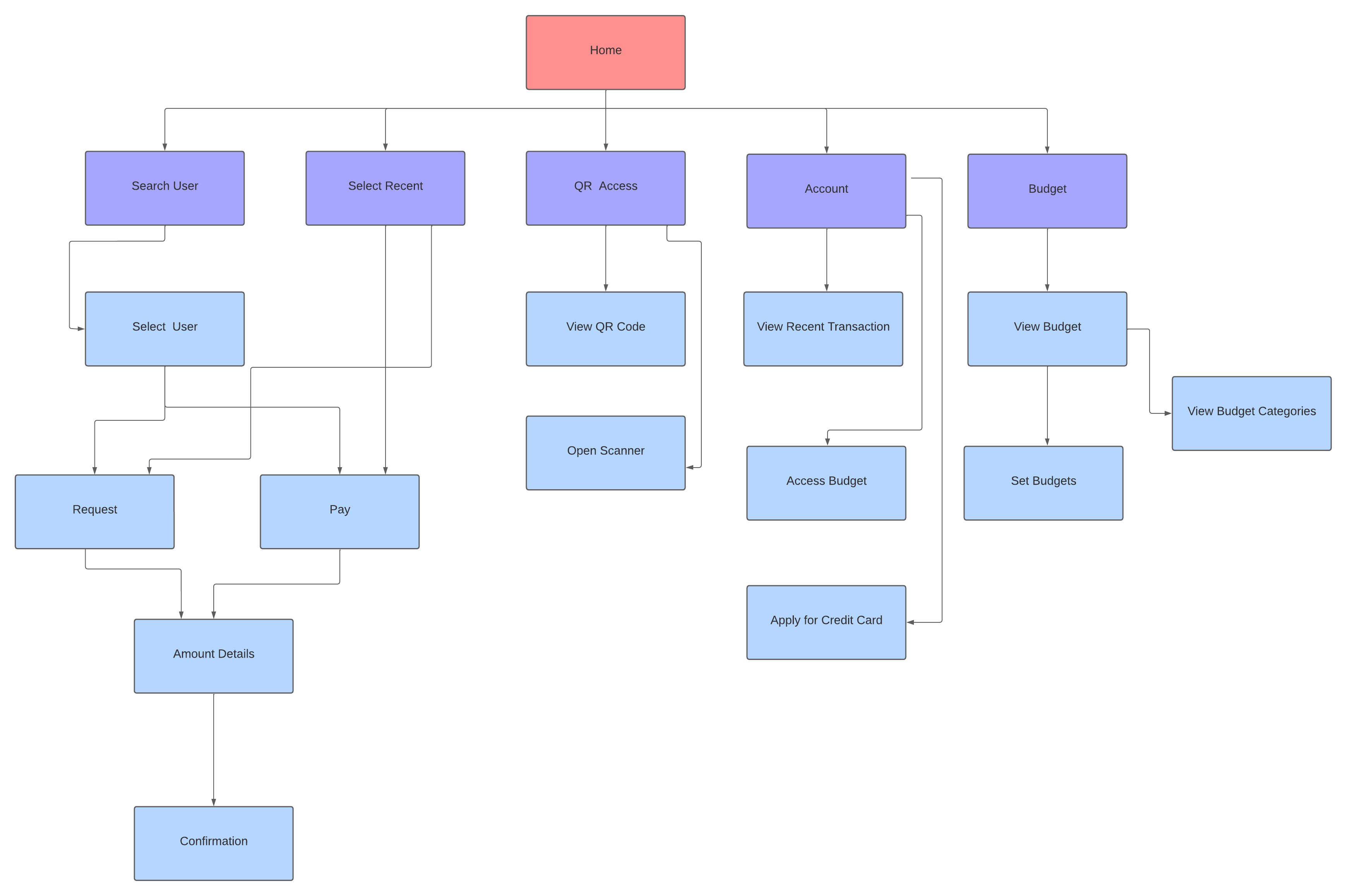
*I ran sorting tests with eight users to come up with the site map above, based on the user's understanding of the categories.
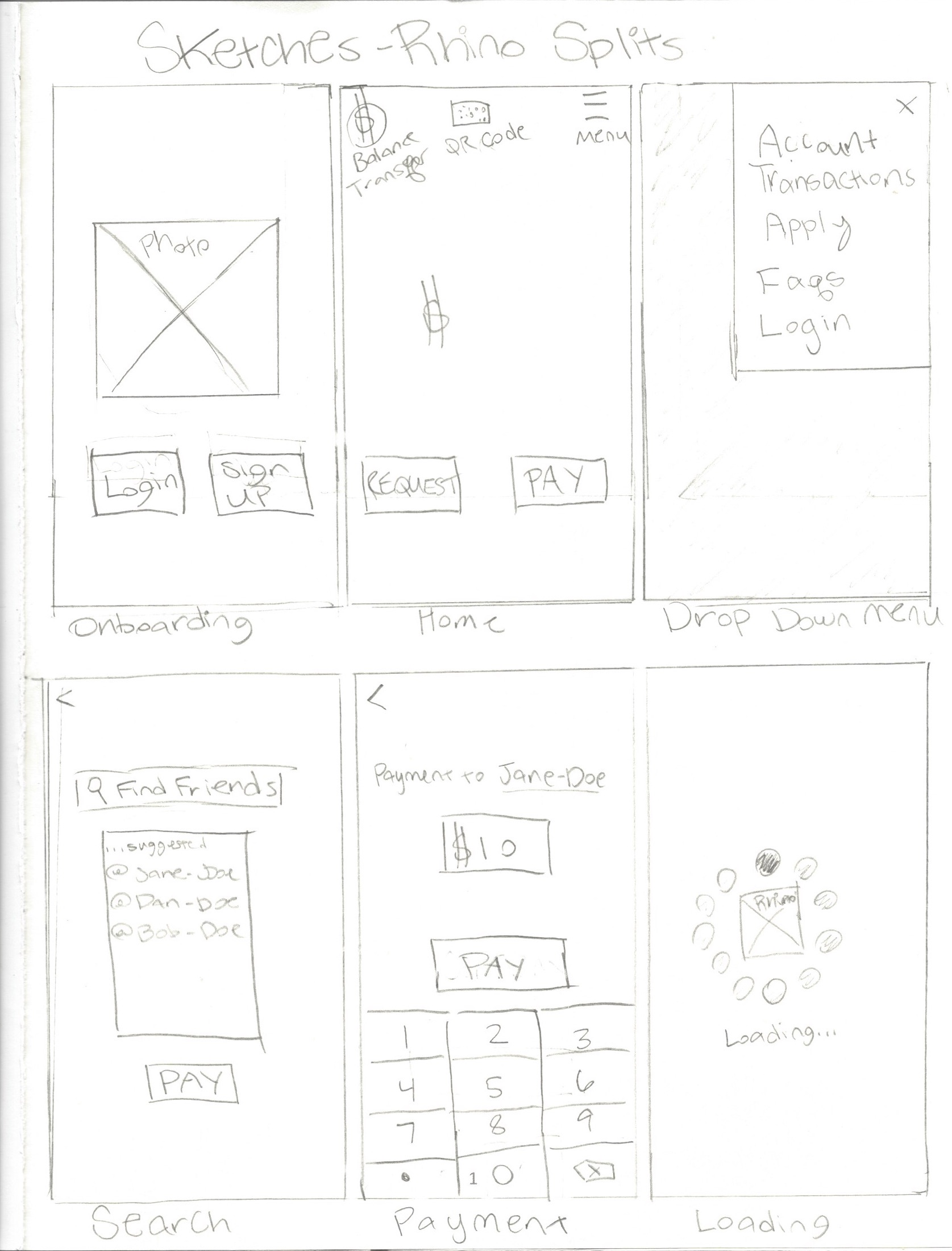
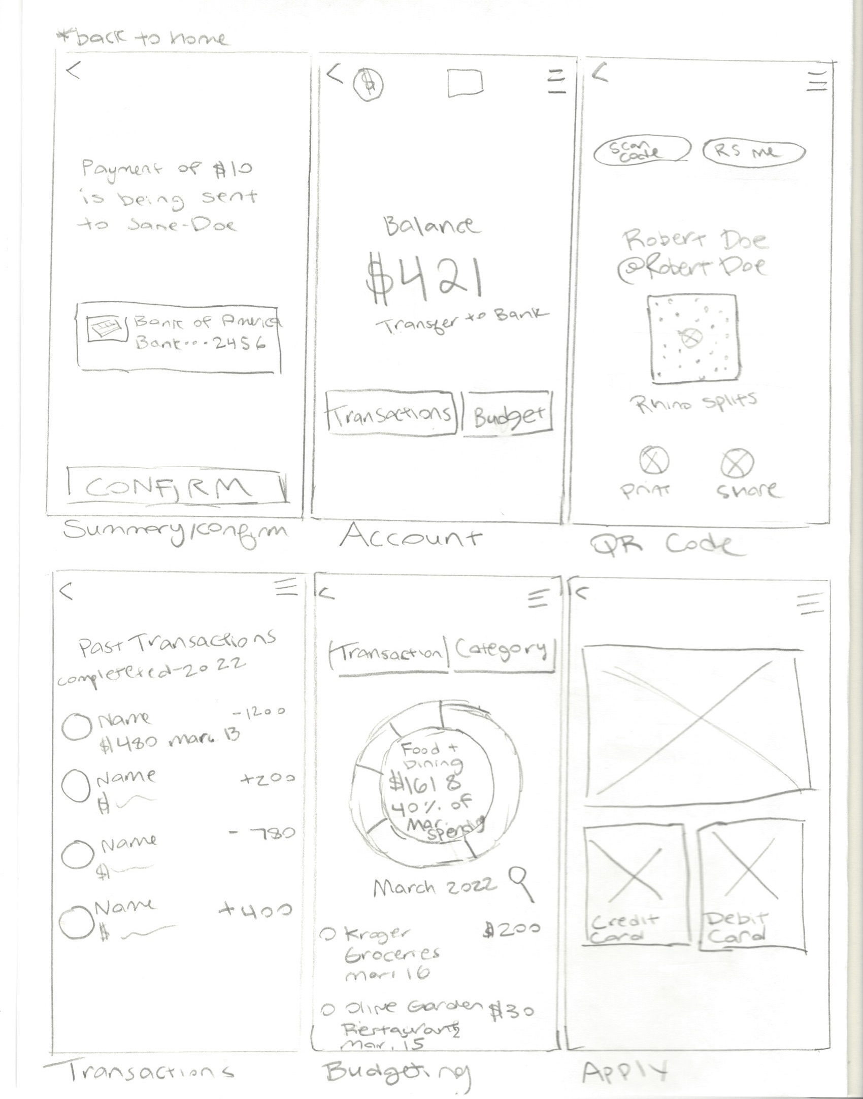
After interviewing the users, my findings showed that the users wanted a more simplistic version of the competitor's apps. My sketches portray an app where you can send and receive money, check your transactions and create a budget, without having to comment or have your finaces displayed on a public feed.
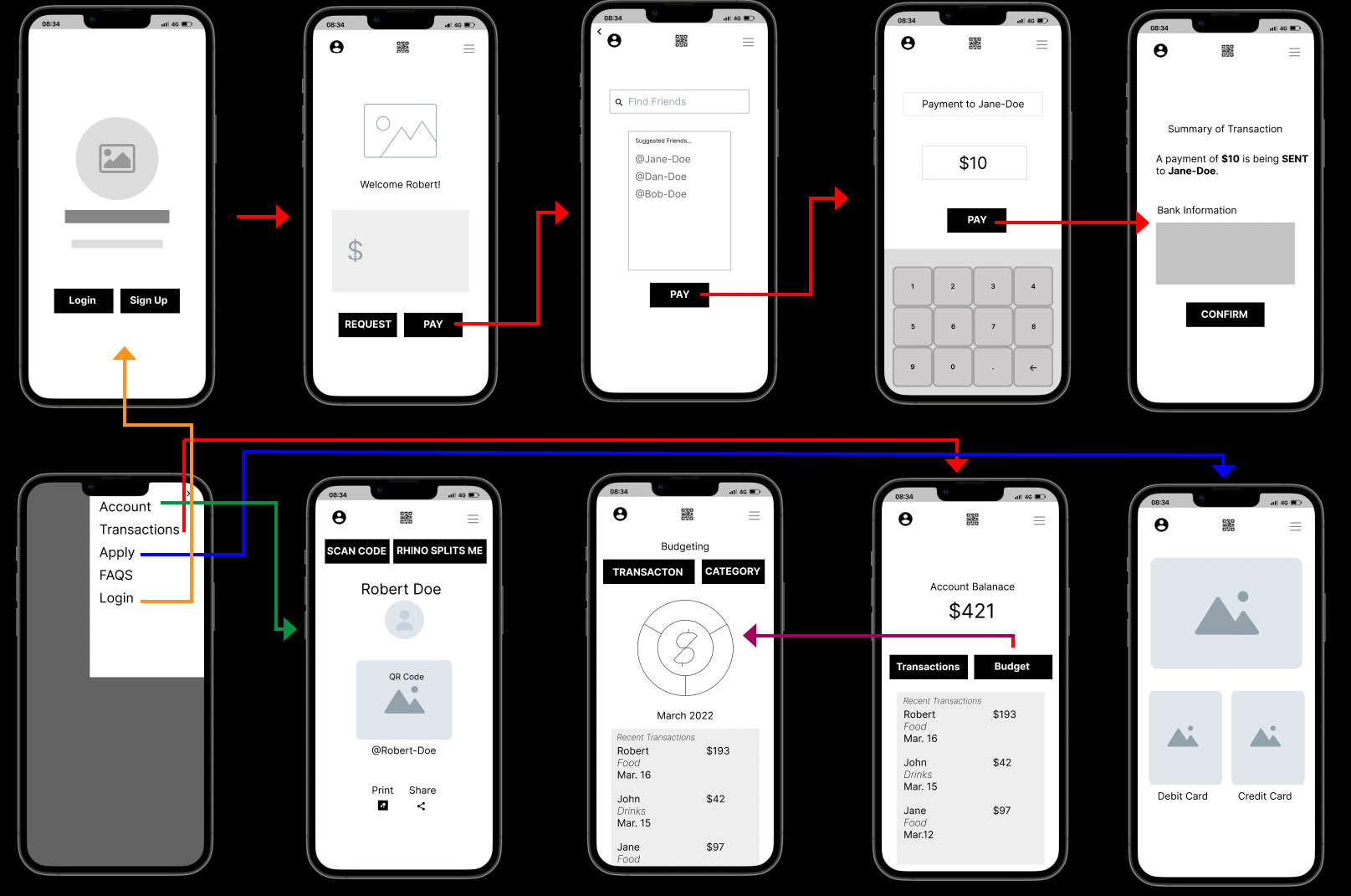
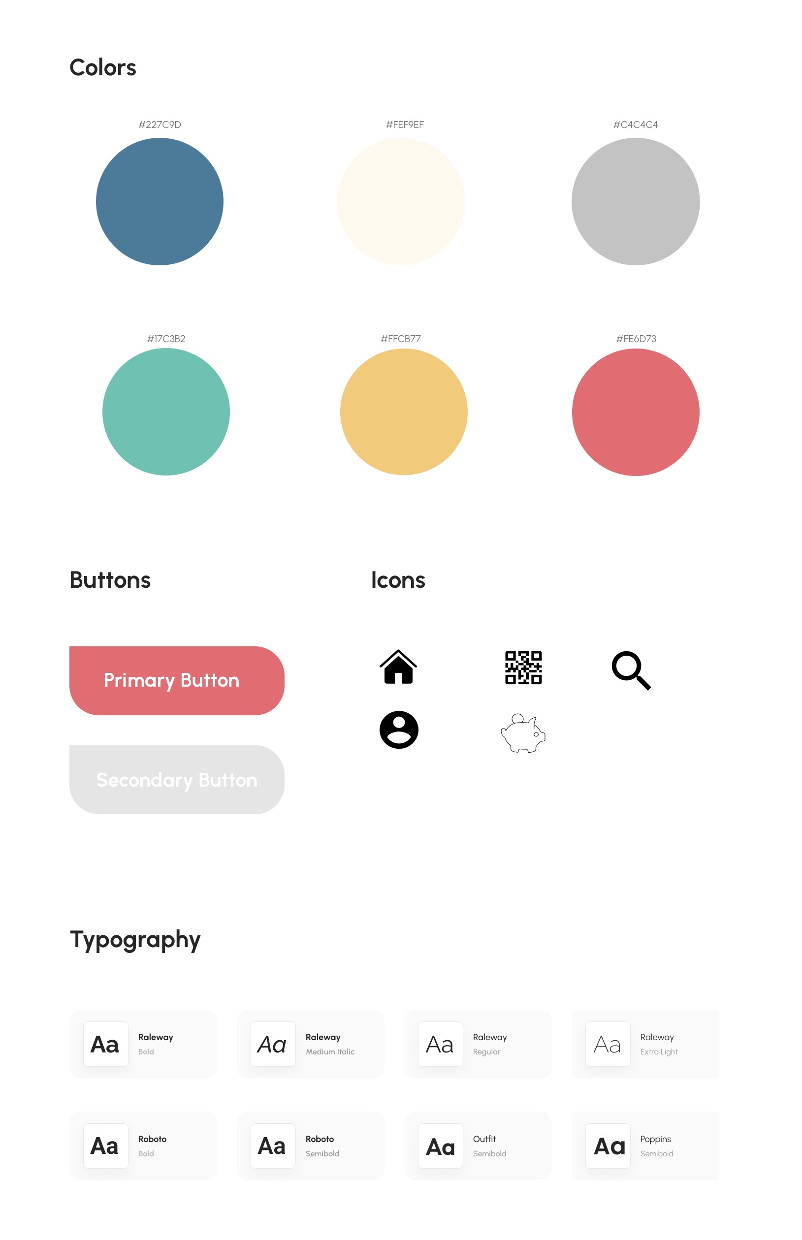
After doing in-depth interviews with the users, I found that the best way to do that would be to get rid of all the "extras" that they were dealing with with other similar apps. I also made the change of moving the navigation from the top, where I had it in the wireframe, to the bottom, where it is more easily accessible to the user's thumb.
I ran two batches of user's tests. The first test was with hi-fi prototype. One key lesson I learned was to give the user's a scenerio-based task to complete and to explain that task before they have the phone in their hands. When waiting too long to explain the task, the user's would start exploring the app before understanding their objective. While the user's had a very easy time accomplishing their tasks and navigating the app, one key pain point for them was that they didn't recieve a defined comfirmation of their transaction being sent and, therefore, were unsure if they had sent it. While I had questioned this design decision, myself, my assumptions were that the animation I had included saying that the money sent would be indiciative enough of the confirmation. With this discovery, I redeisgned the animation and adding a confirmation screen, making it very clear that their trasaction had been completed. I ran my second batch of user tests with the resign and found that this was much more successful at maintaining the user's trust that the app was working properly. Give more time, I would have liked to run an A/B test, comparing the navigation at the bottom to the navigation at the top, where it previously was, but due to constraints that wasn't able to happen this time.