Manooth Furniture
Mobile & Web Application
UX / UI Design
UX / UI Design
Manooth Furniture is a responsive mobile and web application for an e-commerce store... Manooth Furniture is a fictional business, selling affordable, high-end furniture, made in Ireland. This was a project for my Adobe XD class, led by Adobe-certified instructor, Daniel Scott. Read more
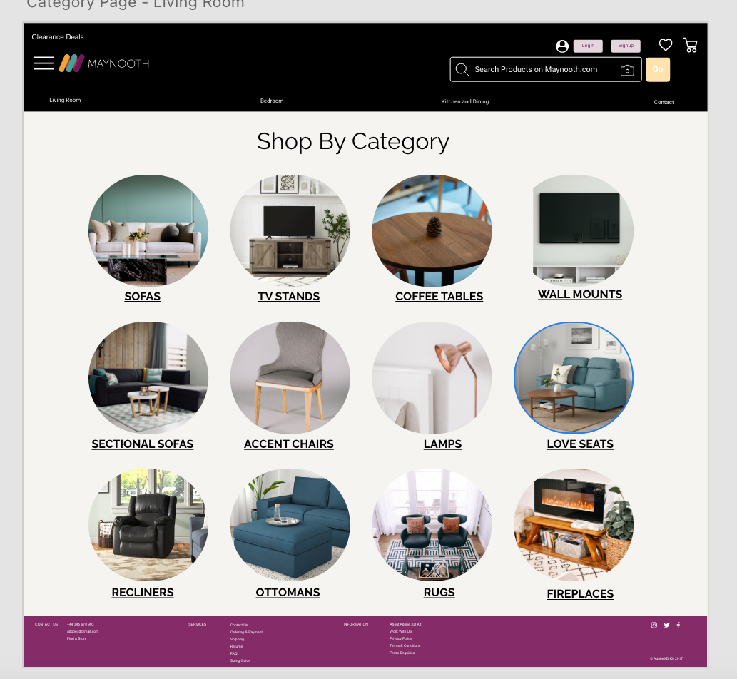
To build an e-commerce website and app for people to browse and purchase furniture for home delivery. The website should include: 1. Homepage (With a Nav {Living Room, Bedroom, Kitchen, Dining Room}, Hero Slider, New in Store, Inspiration Ideas, Clearance and a Footer) 2. Category Page and 3. Product Page
As a student, my role was to create this entire website from the ground up, as well as a full app. I created wireframes, prototypes, mockups and ran usability tests.
Since this was a brand new website, no existing data was available. However, since it is from an existing field, I was able to locate data online that applied to our users. Based on that data, I created a user persona for Manooth Furniture. I continued to keep that user persona in mind for every decision that I made for Manooth Furniture.
I wanted to start building the website first and the app second, so to keep the theme and user experience of the two quite similar. I approach all my designs with three main objectives, to make them useful, usable and valuable. First, I focused on strategy, to find out what the business wanted, what the stakeholders wanted and what the users wanted. I, then, created and prioritized an informational architecture outline. I decided the “hierarchy tree” was the best information architecture model for displaying our information, since this was going to be a content heavy e-commerce website. When creating my wireframe, I separated items of less visual heirachry from those of higher importance using contrast. Going into this, I wanted to keep core principles of Interaction Design, such as; consistency, visibility, predictability, learnability and feedback at the forefront of my design process.
I started with a sliding hero image to get the user’s attention. I kept the home page simple, using drop down menus to guide the user to their perceived destination.

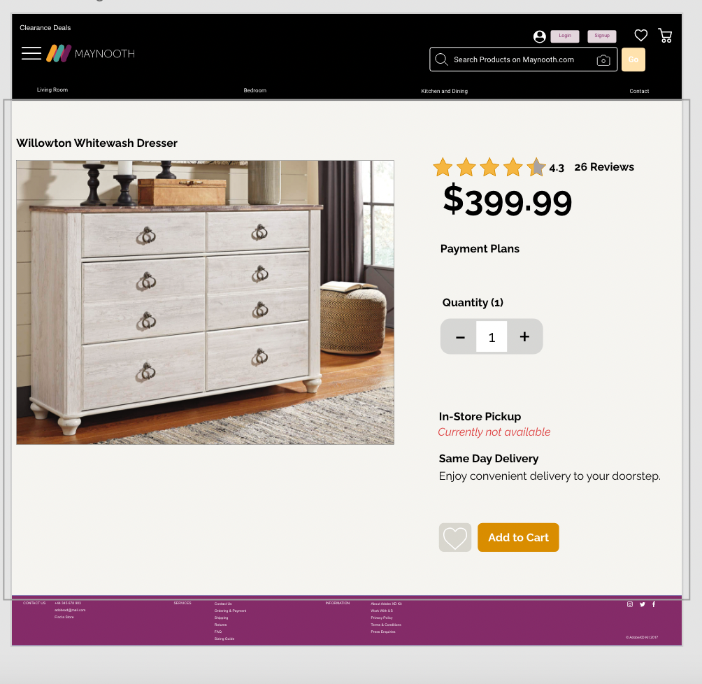
On the product page, I added an interactive design, by making the star ratings pushable and the add to cart button and favorite button interactive.
